
Tiles in Small Spaces: Tricks Designers Use to Make Rooms Look Bigger
When you’re working with a small room — whether it’s a compact bathroom, a galley kitchen, or a hallway — the right tiles can completely change how it feels. But “right” doesn’t just mean the right size or colour. Designers often use a mix of visual tricks, optical illusions, and material choices to give the impression of more space without moving a single wall.
Below are the professional tiling techniques that can make a small space feel instantly more open, airy, and inviting.
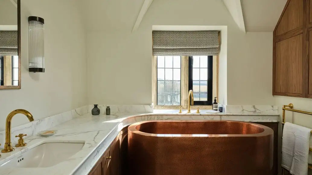
1. Harness the Power of Reflection with Gloss Tiles
Glossy tiles act like built-in light amplifiers, bouncing light around the room and making it feel more spacious. The more light you can reflect — whether natural daylight or warm LED lighting — the more depth your space will appear to have.
-
Best for: Walls in bathrooms, splashbacks in kitchens, or feature areas that catch natural light.
-
Avoid on: Main floors in wet areas — they can be slippery when wet. Opt for matt or slip-resistant tiles there.
-
Pro pairing: Use a matt tile on the floor with a high-sheen tile on the walls to create contrast while still maximising light.
Example: In a small en-suite, a pale, gloss-finish metro tile on the walls paired with warm LED strip lighting above a mirror can make the room feel almost twice its size.
2. Minimise Visual Breaks with Matching Grout
Grout lines can either define your tiles or disappear into them. In a small space, the latter is often better. Choosing grout that matches the tile colour makes the surface feel more continuous, reducing visual interruptions that can make a space feel chopped up.
-
Why it works: Your eye reads the surface as one seamless plane rather than hundreds of small, separated pieces.
-
Pro tip: For patterned or veined tiles, pick a grout colour that matches the tile’s base tone rather than its accent colours for a cleaner look.
Example: A soft beige porcelain tile with a perfectly matched grout in a cloakroom creates the feeling of a warm, uninterrupted wall rather than a grid of tiles.
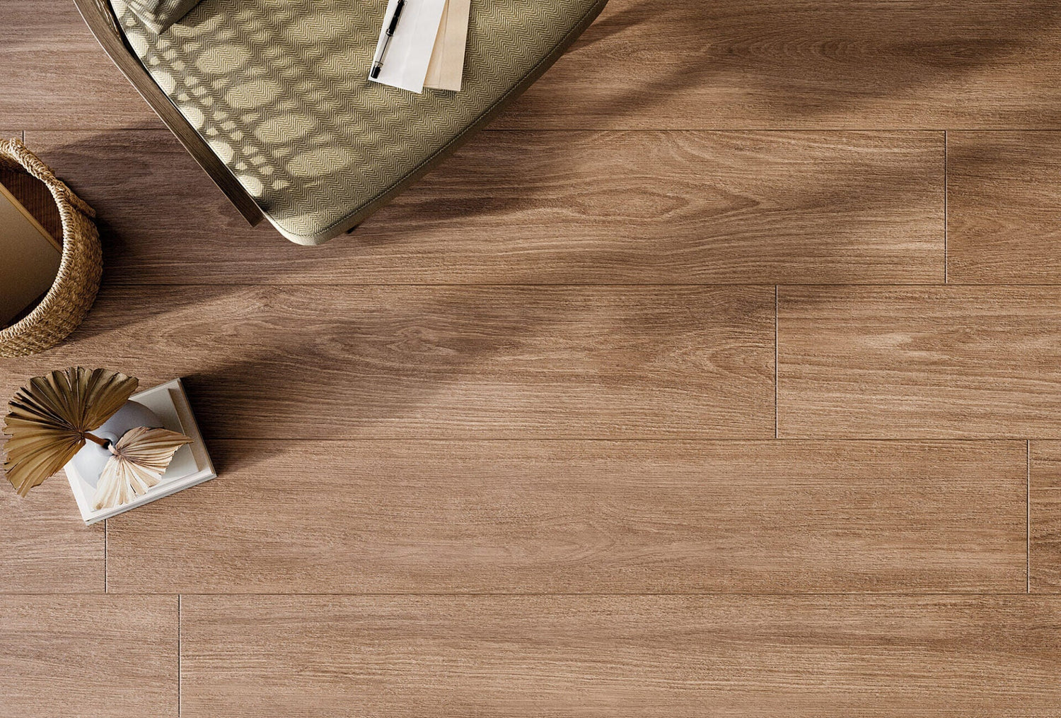
3. Use Directional Patterns to Guide the Eye
Tile layout can lead the eye where you want it to go. Clever pattern placement can make a space feel wider, taller, or even longer than it really is.
-
Horizontal emphasis: Running rectangular tiles horizontally can make narrow rooms feel wider.
-
Vertical emphasis: Stacking tiles vertically (either in straight stack or vertical herringbone) draws the eye upward, making low ceilings feel higher.
-
Diagonal layouts: Diagonals trick the eye into perceiving more depth, especially on floors.
Example: In a galley kitchen, laying floor tiles in a horizontal plank pattern perpendicular to the length of the room can visually “push” the walls outward.
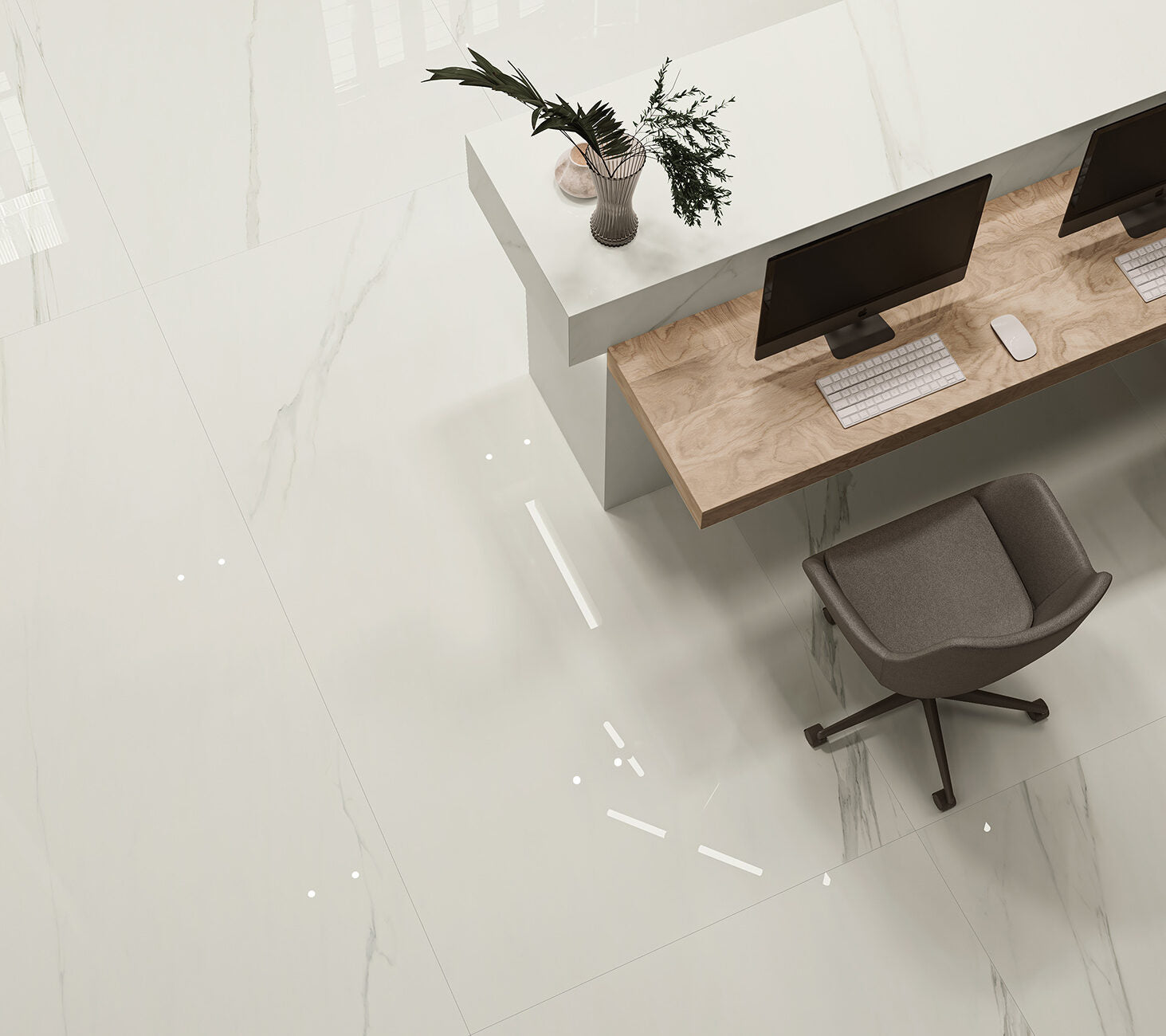
4. Get the Scale Right with Large-Format Tiles
Large-format tiles reduce grout lines, creating a cleaner, more expansive look. But it’s a balancing act — oversized tiles in a tiny room can cause awkward cuts and waste.
-
Sweet spot sizes: 600×600mm or 600×300mm tiles are big enough to look seamless without overwhelming the room.
-
Wall and floor pairing: Use the same large-format tile on both to create continuity.
-
Rectified edges: Opt for tiles with precision-cut edges so grout lines can be as fine as 1.5–2mm.
Example: A small bathroom with a 600×600mm light stone-effect tile on both the walls and floor feels calmer and larger than the same room tiled with 300×300mm tiles in a grid.
5. Wrap Tiles from Floor to Wall
Continuing the same tile from the floor up the wall is a designer favourite for small spaces. This “wraparound” effect blurs where the floor ends and the wall begins, making boundaries disappear.
-
Best effect with: Stone-effect, terrazzo, or microcement-look tiles that have a natural, continuous pattern.
-
Added bonus: Creates a spa-like luxury feel and simplifies cleaning.
Example: A wet room with the same soft-grey porcelain tile running from the shower floor up the wall creates a sleek, seamless cocoon effect.
6. Keep Texture Subtle and Streamlined
While texture adds interest, heavy relief patterns or very bold prints can overwhelm a small space. The key is balance — enough detail to add depth without chopping up the surface visually.
-
Good choices: Satin finishes, soft linear patterns, gentle stone or concrete effects.
-
Avoid: Large, contrasting motifs or overly busy mosaics unless used in a very small feature panel.
Example: A microcement-effect tile in a pale tone provides a gentle texture that catches the light without making the wall feel busy.
7. Use Lighting and Tiles Together
Tiles and lighting are a powerful combination. Positioning lighting so it plays across a glossy or subtly textured surface adds depth and movement.
-
Wall washes: LED strips along the top or bottom of a tiled wall enhance the texture and colour of the tile.
-
Mirror placement: A large mirror opposite a gloss-tiled wall doubles the light and the sense of space.
Example: In a windowless downstairs loo, a gloss white tile paired with a large backlit mirror can create the illusion of a bright, airy space.
Bringing It All Together
The key to making a small space feel bigger isn’t one single trick — it’s layering several of these techniques together. For example:
-
A large-format, pale, gloss tile on walls.
-
Matching grout to keep surfaces seamless.
-
Vertical stack layout to increase height.
-
Under-cabinet LED lighting to bounce off the tile surface.
By thinking beyond the basic “bigger tiles, lighter colours” advice and using these professional tricks, you can create small rooms that feel light, open, and perfectly balanced.
Need help choosing the perfect combination? Our design team can guide you through sizes, layouts, finishes, and lighting pairings to maximise your space’s potential — without compromising on style.